KUAN-YAN
GALLERY
Type | Commercial
Built-up Size | 39m² / 12P
Location | Taipei, Taiwan
Photography | HeyCheese! Photography
-
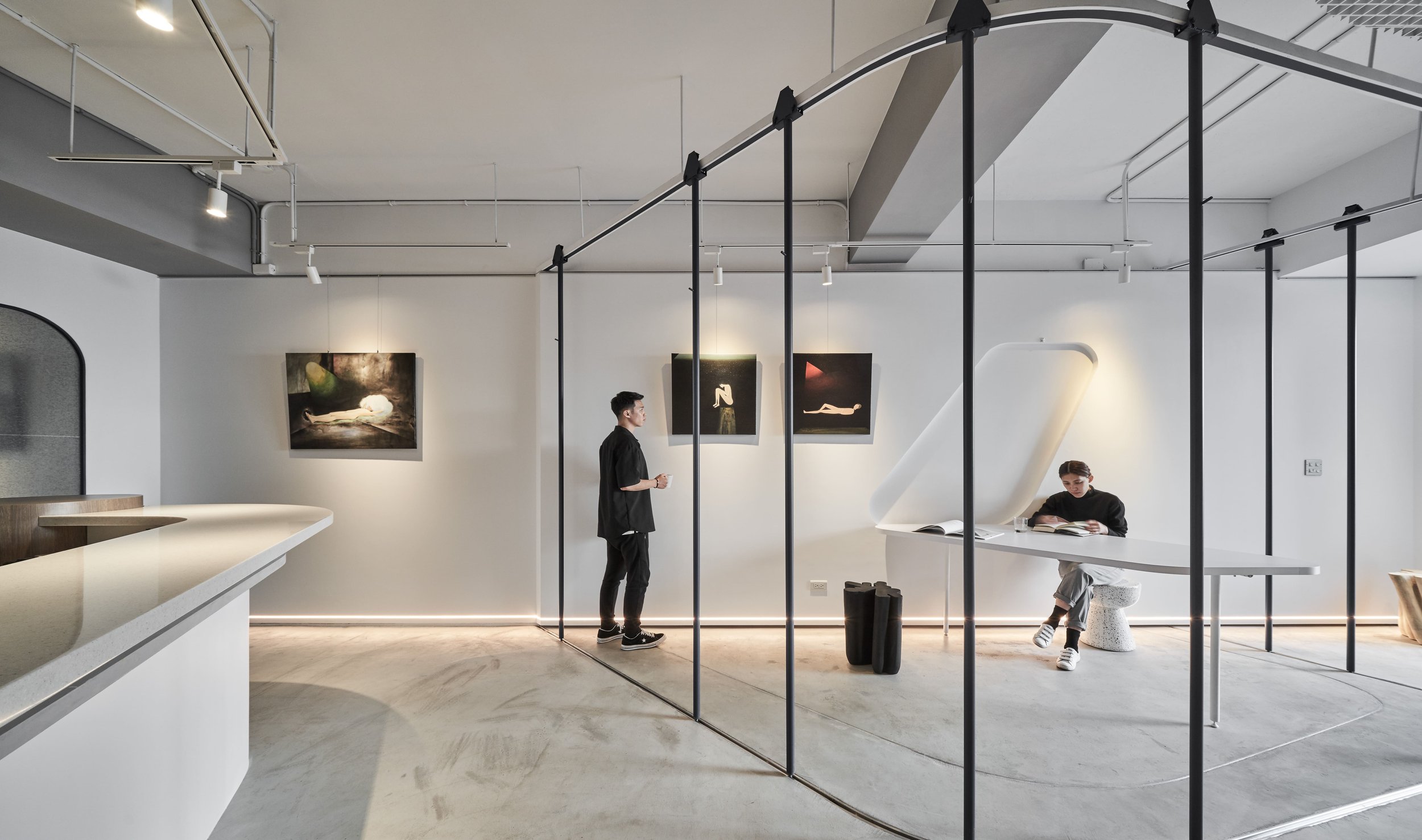
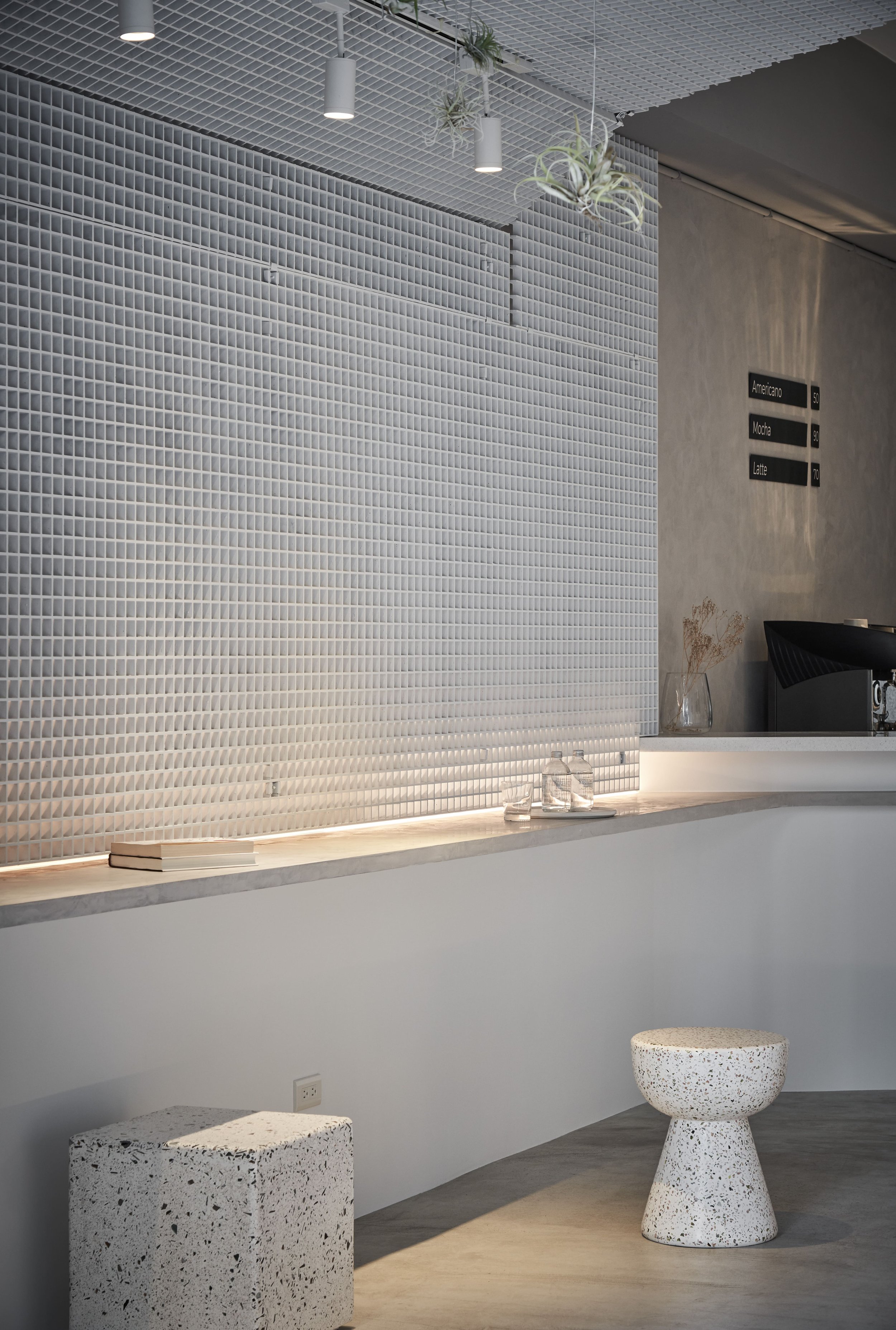
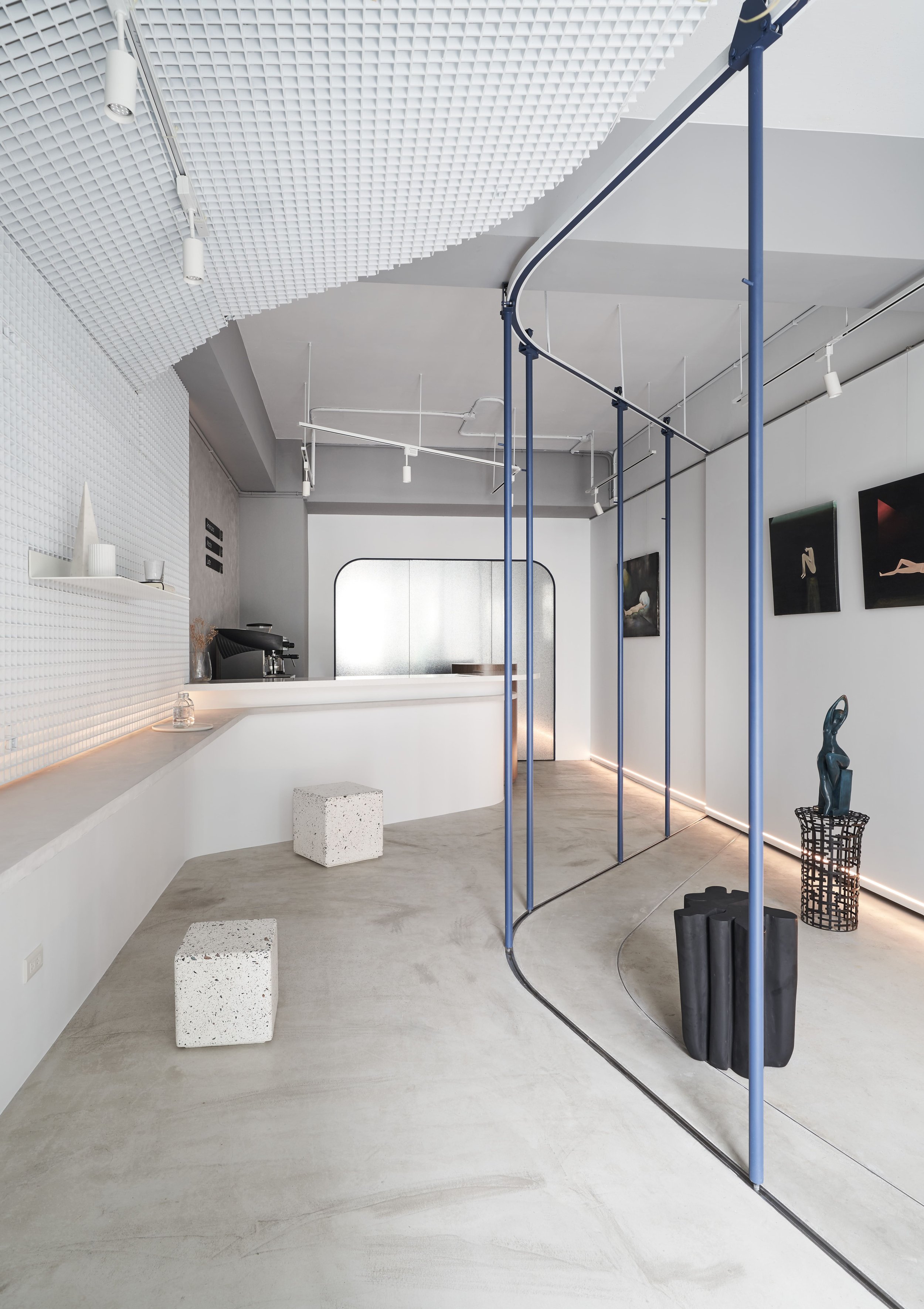
一種藝術姿態的方式呈現,有別於大眾街店咖啡廳或藝廊的空間概念。隱身於中原大學旁的巷弄間,以流動彎曲線的思考切割,打破狹長型店鋪的既定框架。低調純樸、空間環境必須隱含了美學事物,並將空間的彈性變化、動線規劃、使用機能作為規劃之操作重點。 進門的左右兩側皆為展示區域。右側牆面可依畫作尺寸調配吊畫軌道與展示比例,左側壁面則規劃了網格框架及展示檯面。網格框架延伸至天花板,可利於日後需求作固定展示層板與垂吊畫作使用。在規劃平面圖時,為了達到空間中視覺的最大化,操作吧台適度的退讓,人們進門後得以看見空間的最大深度,而弧形吧台與展示檯面延伸,則增添了空間趣味性。 當空間不再被冠上既定名詞,空間的可調配性則相對地活潑了,亦如「藝術」一樣有深度的。空間中的活動圓桿猶如空間指揮家,操控著空間之動線與行為可能。
-
The concept of this F&B space is slightly different from general cafes or art galleries concept, which is more likely presented by an artistic way. Fundamentally the lengthy narrow shaped shop lot is hidden between buildings and alleys which is not given much natural sunlight. Thus, we tried to break through the ordinary narrow layout with more curvy and variable elements. We also do believe that a minimalist environment does not equal to simple and dull. On the contrary, it is definitely including certain aesthetically elements, alongside with flexibility space, flexibility pathways, and variable interactions possibilities. Viewing from the entrance, both sides of the lengthy walls given the opportunities to organized as display areas. Hanging rails are installed in the flat white wall which can be hanging variable size of art paintings. On the opposite wall, we created a large grid frame which is able to place and connect with the portable racks, and hanging art works. On the other hand, the curvy-look coffee bar physically given out more space for the display area, as well as to enlarge the look of the narrow-like shop house. Apparently, there is no certain title nor adjective to describe a certain artwork. Thus, instead of labelling areas or spaces with designated titles, we believe that areas can be labelling itself by various behaviours and objects, with different arrangements by movable steel poles which are designed with track and wheels.


